MATTER
MUSIC AND PODCAST FESTIVAL
TIMELINE
March 2024 - June 2024
ROLE
Brand Design, UX and UI Design
CONTEXT
HCDE 308 Project

THE TASK
Create a conceptual 3-day music festival hosted on the University of Washington campus
Conduct and apply research to develop a unique festival
Utilize visual design principles to build distinct and cohesive branding and deliverables
Develop a high-fidelity mobile interface prototype
JUMP AHEAD
PHASE 1: RESEARCH
COMPETITOR ANALYSIS
This process began with a competitor analysis to understand the market I was designing for. This led me to research different music festivals in Washington State: Watershed, Timber!, and Capitol Hill Block Party.
PERSONAS
RESEARCH RESULTS
By conducting preliminary research, I used the findings to develop a core value proposition and unique selling point for my festival.
PHASE 2: BRANDING
MOODBOARD
The largest inspiration for my designs came from early 20th-century cartoons, a style that has become re-popularized in recent years. Designs including the character often use script and serif fonts and have a bright and vintage feel.
Similar vintage-inspired designs have become popular among many artists and content creators that are popular with Gen Z. Since my festival is designed for a Gen Z audience, I wanted the overall vibe to reflect popular designs.
The festival name, Matter, was derived from the phrase “You Matter.” With the focus of this festival being on creators who are important to Gen Z, it is also important that the festival embodies their values as well. “You matter” and other variations of the phrase have become popular Gen Z mantras, serving as reminders that each individual is important and has value.
LOGOMARK
FINAL VERSION
V1
V2
V3
PHASE 3: DESIGN DELIVERABLES
TICKET REDESIGN
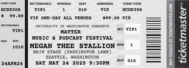
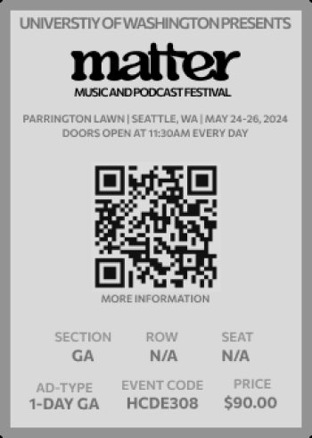
For my ticket redesign, I decided to create a commemorative sticker. Specifically, I chose a sticker because of my audience, Gen Z, college students. Many students use unique stickers to decorate their laptops, water bottles, etc. to showcase their personalities and experiences. For the size, I decided to make it 2.5 x3 inches, so it could easily fit on a standard reusable water bottle or laptop.
BEFORE
SIGNAGE
AFTER
The signage I chose is primary freestanding. Since the majority of the festival space is open, designing the signage to be freestanding allows it to be placed anywhere without relying on existing infrastructure.
The signage is 7 ft tall and bright orange because I wanted it to stand out in a crowd of people so that it would be easy for attendees to find.
FESTIVAL MAP
When designing this map, I wanted to ensure that the main locations were easily identifiable. The stages, for example, are the most important landmarks and can be recognized by a distinct orange color. They are also labeled with a large number to make them easily identifiable and to help colorblind users.
FRONT
BACK
PHASE 4: HI-FI PROTOTYPE
USER FLOW
The task in the user flow represented below is buying a ticket to the festival.
I selected the persona Jake for this user flow because he doesn't have experience buying concert tickets. This forced me to think about what screens and options might be needed to make the process easy for someone who is unfamiliar with buying tickets. Further, it helped me to recognize ways a user journey might not be linear to help ensure the interface is intuitive for all users.
To meet the needs of users like Jake some features of this user flow include:
Allowing users to browse the app, only having to provide contact information if they purchase tickets
Allowing users to easily return to the previous page
WIREFRAMES + ‘USABILITY TESTING’
After developing digital wireframes, I created a lo-fi prototype with a single, limited user flow. I conducted a usability test with three participants to gather user feedback on the wireframes.
During usability, participants gave the following critique:
Users were frustrated that they couldn't add different ticket types to the same order
Participants also noted that the ticket options, specifically “Day 3” vs. “3- Day” were confusing. They have since been relabeled tickets to “1-Day” and “All weekend.”
They wanted more information about the tickets, without having to open an additional window/screen
MOBILE INTERFACE PROTOTYPE
Based on the user feedback, I revised my wireframes. One key piece of feedback I received, was to test my prototype on my phone, to udnerstand how it would actual feel to use my interface. This challenged me to think more intentionally about font and button sizes.
*Use the button in the top right corner to expand for the optimal experience
Key changes:
Users can now add tickets to their cart instead of immediately having to purchase them
Ticket information has been organized in a drop-down menu to reduce visual clutter
Reduced font size to improve readability when accessed on a mobile device
FINAL PROTOTYPE
KEY TAKEAWAYS
RAPID ITERATION IS KEY
Given the tight turnaround time for each deliverable, effective time management was essential. The limited timeframe encouraged me to experiment with various layouts, resulting in a unique set of ideas to build upon. Rapid ideation creates a strong foundation of ideas to pull from, enabling the efficient development of a strong final product.
USERS KNOW BEST
While each student developed their concepts and designs individually, throughout this course we participated in weekly critiques to share our work. I found our weekly critiques particularly beneficial when I received honest, critical feedback. The process is not solely about producing a polished final product but also about evolving as collaborators. Although we worked on individual projects, the insights gained from others significantly enhanced my designs, ultimately leading to a better experience for my audience.


